

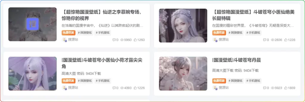
本文转载自搜源站,如本文侵权,请联系小编侵删!
在 WordPress 建站过程中,子比主题凭借其强大的功能和美观的界面深受广大站长喜爱。今天为大家带来一个超酷炫的子比主题美化技巧 —— 让文章封面缩略图在鼠标悬停时显示动态圆圈 LOGO,不仅能提升网站的整体视觉效果,还能增强用户体验,下面就来详细介绍。
一、子比主题美化特色:动态 LOGO 设计
子比主题美化在封面缩略图设计上独具匠心,采用了动态 LOGO这一设计元素。当用户鼠标悬停在封面缩略图上时,动态圆圈 LOGO 会缓缓展开,与此同时,更多关于子比主题美化的介绍和描述也会随之展示出来。通过这种方式,用户可以快速了解到这款主题的特色和亮点,既让封面缩略图更具吸引力,又为用户提供了一种直观获取信息的方式,大大提升了用户体验和使用便捷性。
二、操作步骤:为子比主题添加动态圆圈 LOGO 效果
- 准备工作:确保你使用的是 WordPress 的子比主题(zibll),且对主题设置有一定的操作权限。
- 添加 CSS 代码:这是实现该效果的关键步骤。将以下 CSS 代码追加保存到主题设置 -> 自定义代码 -> 自定义 CSS 代码中:
- LOGO可以换成自己的链接。
三、效果(一)
![图片[1]-WordPress 子比主题美化教程:文章封面缩略图悬停展示动态LOGO「子比主题美化」-追梦人](https://cdn.dreamren.cn/wp-content/uploads/2025/06/f3bdc0089520250315004853-1024x342-1.webp?imageMogr2/format/webp/blur/1x0/quality/100)
![图片[2]-WordPress 子比主题美化教程:文章封面缩略图悬停展示动态LOGO「子比主题美化」-追梦人](https://cdn.dreamren.cn/wp-content/uploads/2025/06/20250315_05504-1.gif?imageMogr2/format/webp/blur/1x0/quality/100)
.item-thumbnail {
  position: relative;
  overflow: hidden;
  transition: transform 0.4s ease;
}

.item-thumbnail:hover {
  transform: translateY(-5px);
}

.item-thumbnail:before {
  content: '';
  position: absolute;
  top: 0;
  left: 0;
  right: 0;
  bottom: 0;
  background: linear-gradient(to bottom, rgba(0,0,0,0) 0%, rgba(0,0,0,0.2) 100%);
  transition: all 0.4s cubic-bezier(0.165, 0.84, 0.44, 1);
  border-radius: 8px;
  z-index: 2;
  max-width: 765px;
  margin: 0 auto;
  pointer-events: none;
  padding-left: 10px;
  box-shadow: 0 5px 15px rgba(0,0,0,0);
}

.item-thumbnail:after {
  content: '';
  position: absolute;
  top: 50%;
  left: 50%;
  width: 50px;
  height: 50px;
  margin: -25px 0 0 -25px;
  background: url(https://gcore.jsdelivr.net/gh/vipy800/viptu/img/logo.png);
  background-repeat: no-repeat;
  background-size: 100% 100%;
  z-index: 3;
  transform: scale(0.8) rotate(-10deg);
  transition: all 0.5s cubic-bezier(0.175, 0.885, 0.32, 1.275);
  opacity: 0;
  pointer-events: none;
  filter: drop-shadow(0 0 8px rgba(255,255,255,0.6));
}

.item-thumbnail:hover:before {
  background: linear-gradient(135deg, rgba(0,0,0,0.7) 0%, rgba(0,0,0,0.4) 100%);
  box-shadow: 0 8px 25px rgba(0,0,0,0.3);
}

.item-thumbnail:hover:after {
  transform: scale(1) rotate(0deg);
  opacity: 1;
  animation: pulse 1.5s infinite alternate ease-in-out;
}

@keyframes pulse {
  0% {
    filter: drop-shadow(0 0 5px rgba(255,255,255,0.6));
  }
  100% {
    filter: drop-shadow(0 0 15px rgba(255,255,255,0.8));
  }
}
四、效果(二)
![图片[3]-WordPress 子比主题美化教程:文章封面缩略图悬停展示动态LOGO「子比主题美化」-追梦人](https://cdn.dreamren.cn/wp-content/uploads/2025/06/2d89766ef720250315004944-1024x336-1.webp?imageMogr2/format/webp/blur/1x0/quality/100)
![图片[4]-WordPress 子比主题美化教程:文章封面缩略图悬停展示动态LOGO「子比主题美化」-追梦人](https://cdn.dreamren.cn/wp-content/uploads/2025/06/20250315_05358.gif?imageMogr2/format/webp/blur/1x0/quality/100)
.item-thumbnail:before {
  content: '';
  position: absolute;
  top: 0;
  left: 0;
  right: 0;
  bottom: 0;
  background: rgba(0,0,0,0);
  transition: background .35s;
  border-radius: 8px;
  z-index: 2;
  max-width: 765px;
  margin: 0 auto;
  pointer-events: none;
  padding-left: 10px
}

.item-thumbnail:after {
  content: '';
  position: absolute;
  top: 50%;
  left: 50%;
  width: 40px;
  height: 40px;
  margin: -20px 0 0 -20px;
  background: url(https://gcore.jsdelivr.net/gh/vipy800/viptu/img/logo.png);background-repeat: no-repeat;
  background-size: 100% 100%;
  z-index: 3;
  -webkit-transform: scale(2);
  transform: scale(2);
  transition: opacity .35s,-webkit-transform .35s;
  transition: transform .35s,opacity .35s;
  transition: transform .35s,opacity .35s,-webkit-transform .35s;
  opacity: 0;
  pointer-events: none;
}

.item-thumbnail:hover:before {
  background: rgba(0,0,0,.5)
}

.item-thumbnail:hover:after {
  -webkit-transform: scale(1);
  transform: scale(1);
  opacity: 1
}
五、效果(三)
![图片[5]-WordPress 子比主题美化教程:文章封面缩略图悬停展示动态LOGO「子比主题美化」-追梦人](https://cdn.dreamren.cn/wp-content/uploads/2025/06/0e7cb990dc20250315005103-1024x334-1.webp?imageMogr2/format/webp/blur/1x0/quality/100)
![图片[6]-WordPress 子比主题美化教程:文章封面缩略图悬停展示动态LOGO「子比主题美化」-追梦人](https://cdn.dreamren.cn/wp-content/uploads/2025/06/20250315_05227.gif?imageMogr2/format/webp/blur/1x0/quality/100)
.item-thumbnail {
  position: relative;
  overflow: hidden;
  transform: translateZ(0);
}
.item-thumbnail:before {
  content: '';
  position: absolute;
  top: 0;
  left: 0;
  right: 0;
  bottom: 0;
  background: rgba(0,0,0,0);
  transition: all 0.4s cubic-bezier(0.4,0,0.2,1);
  border-radius: 12px;
  z-index: 2;
  max-width: 765px;
  margin: 0 auto;
  pointer-events: none;
  box-shadow: 0 0 0 rgba(0,0,0,0);
}
.item-thumbnail:after {
  content: '';
  position: absolute;
  top: 50%;
  left: 50%;
  width: 56px;
  height: 56px;
  margin: -28px 0 0 -28px;
  background: url(https://gcore.jsdelivr.net/gh/vipy800/viptu/img/logo.png) center/contain no-repeat;
  z-index: 3;
  transform: scale(1.8) rotate(15deg);
  transition: all 0.5s cubic-bezier(0.68, -0.55, 0.265, 1.55);
  opacity: 0;
  filter: drop-shadow(0 2px 8px rgba(0,0,0,0.2));
}
.item-thumbnail:hover:before {
  background: rgba(0,0,0,0.6);
  box-shadow: 0 8px 24px rgba(0,0,0,0.15);
  border-radius: 16px;
}
.item-thumbnail:hover:after {
  transform: scale(1) rotate(0deg);
  opacity: 1;
  filter: drop-shadow(0 4px 12px rgba(0,0,0,0.3));
}
六、效果(四)
![图片[7]-WordPress 子比主题美化教程:文章封面缩略图悬停展示动态LOGO「子比主题美化」-追梦人](https://cdn.dreamren.cn/wp-content/uploads/2025/06/77517ecb6620250315005710-1024x344-1.webp?imageMogr2/format/webp/blur/1x0/quality/100)
![图片[8]-WordPress 子比主题美化教程:文章封面缩略图悬停展示动态LOGO「子比主题美化」-追梦人](https://cdn.dreamren.cn/wp-content/uploads/2025/06/20250315_05633.gif?imageMogr2/format/webp/blur/1x0/quality/100)
.item-thumbnail {
  position: relative;
  overflow: hidden;
  transition: all 0.5s cubic-bezier(0.2, 0.8, 0.2, 1);
  border-radius: 8px;
}

.item-thumbnail:hover {
  transform: translateY(-8px) scale(1.02);
  box-shadow: 0 15px 30px rgba(0, 0, 0, 0.2);
}

.item-thumbnail:before {
  content: '';
  position: absolute;
  top: 0;
  left: 0;
  right: 0;
  bottom: 0;
  background: linear-gradient(45deg, rgba(66, 0, 255, 0.2) 0%, rgba(255, 0, 140, 0.2) 100%);
  transition: all 0.6s cubic-bezier(0.165, 0.84, 0.44, 1);
  border-radius: 8px;
  z-index: 2;
  max-width: 765px;
  margin: 0 auto;
  pointer-events: none;
  padding-left: 10px;
  backdrop-filter: blur(0px);
}

.item-thumbnail:after {
  content: '';
  position: absolute;
  top: 50%;
  left: 50%;
  width: 60px;
  height: 60px;
  margin: -30px 0 0 -30px;
  background: url(https://gcore.jsdelivr.net/gh/vipy800/viptu/img/logo.png);
  background-repeat: no-repeat;
  background-size: 100% 100%;
  z-index: 3;
  transform: scale(0) translateY(20px);
  transition: all 0.7s cubic-bezier(0.19, 1, 0.22, 1);
  opacity: 0;
  pointer-events: none;
  filter: drop-shadow(0 0 10px rgba(255, 255, 255, 0.8));
}

.item-thumbnail:hover:before {
  background: linear-gradient(135deg, rgba(66, 0, 255, 0.6) 0%, rgba(255, 0, 140, 0.4) 100%);
  backdrop-filter: blur(3px);
  box-shadow: inset 0 0 30px rgba(255, 255, 255, 0.2);
}

.item-thumbnail:hover:after {
  transform: scale(1) translateY(0);
  opacity: 1;
  animation: float 3s infinite ease-in-out, glow 2s infinite alternate;
}

@keyframes float {
  0% {
    transform: translateY(0) rotate(0deg) scale(1);
  }
  50% {
    transform: translateY(-10px) rotate(5deg) scale(1.05);
  }
  100% {
    transform: translateY(0) rotate(0deg) scale(1);
  }
}

@keyframes glow {
  0% {
    filter: drop-shadow(0 0 5px rgba(255, 255, 255, 0.8));
  }
  100% {
    filter: drop-shadow(0 0 20px rgba(255, 255, 255, 1)) drop-shadow(0 0 30px rgba(66, 0, 255, 0.6));
  }
}

.item-thumbnail::before {
  content: '';
  position: absolute;
  inset: -3px;
  background: linear-gradient(45deg, #ff00cc, #3300ff, #00ccff, #ff00cc);
  background-size: 400% 400%;
  z-index: -1;
  border-radius: 10px;
  opacity: 0;
  transition: opacity 0.5s ease;
  animation: gradientBG 6s ease infinite;
}

.item-thumbnail:hover::before {
  opacity: 1;
}

@keyframes gradientBG {
  0% {
    background-position: 0% 50%;
  }
  50% {
    background-position: 100% 50%;
  }
  100% {
    background-position: 0% 50%;
  }
}本站资源均为网友推荐收集整理而来,请勿商业运营,仅供学习和研究,请在下载后24小时内删除!!
© 版权声明
文章版权归作者所有,未经允许请勿转载。
THE END


暂无评论内容